Game Design, iOS
Basic iPhone And iPad Screen Component Pixel Dimensions
This post first appeared on www.vickiwenderlich.com.
Update: A more recent chart can be found here, updated for Retina dimensions!
When I start a mockup of an iPhone/iPad app, I often need to double-check the dimensions of the iPad or iPhone screen sizes and standard components like toolbars. Really basic stuff, but I can’t keep all the exact pixel dimensions straight.
When I search online, the numbers I want are buried in tutorials or articles or *shudder* SDK documents. I usually end up interrupting Ray to ask him.
Finally, I made myself a couple of reference diagrams. Share them with other designers or developers that might want a quick reference!

Hopefully it will help someone else out there who needs a quick reference. Pass this on to anyone who might find it useful — save it and give it to designers you hire, or bookmark it for when you begin your next project!
For those of you who would prefer a list instead, read on.
iPhone and iPod Touch Pixel Dimensions
Notes:
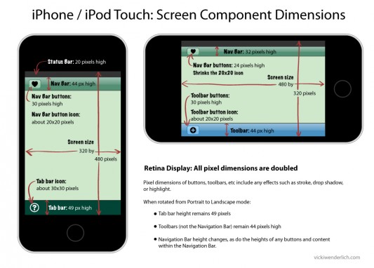
- For iPhone Retina display, all pixel dimensions are doubled.
- All the dimensions for the iPhone (not retina) are the same as for the iPod Touch.
- All pixel dimensions include highlight or stroke effects. For example, a 30-pixel high button is actually a 29-pixel high button with a 1-pixel highlight on the bottom.
iPhone screen size:
- Portrait 320×480 pixels
- Landscape 480×320 pixels
iPhone Nav bar:
- Portrait: 44 pixels high
- Landscape: 32 pixels high
iPhone Nav bar buttons:
- Portrait: 30 pixels high
- Landscape: 24 pixels high
iPhone Nav bar button icons: about 20×20 pixels (when in Landscape mode, it shrinks the 20×20 pixel icon)
iPhone Toolbar: 44 pixels high (does not change)
iPhone Toolbar button: 30 pixels high (does not change)
iPhone Toolbar button icon: about 20×20 pixels
iPhone Tab Bar: 49 pixels high (does not change)
iPhone Tab Bar icon: about 30×30 pixels
iPad Pixel Dimensions
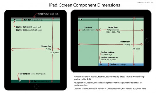
iPad screen size:
- Portrait 768×1024 pixels
- Landscape 1024×768
iPad Navigation Bar and Tool Bars: 44 pixels high
iPad Nav Bar and Tool Bar buttons: 30 pixels high
iPad Nav Bar and Tool Bar button icons: about 20×20 pixels
iPad Tab Bar: 49 pixels high
iPad Tab Bar icons: about 30×30 pixels
iPad List View: 320 pixels wide. This is because when the same app is on the iPhone, the 320 pixel width fits iPhone Portrait mode perfectly.
Those are the notes that I find myself referring to the most; now they are all in one place! In fact, I referred to them twice for my regular work projects since making these reference lists :]
If you have any other basic pixel dimensions that you are always having to look up, please add them in the comments! In the future I may make more of these reference images, so if you have any requests please list them here.


I simply wished to thank you so much again. I do not know what I would have achieved without the actual information revealed by you over this theme. It became a very horrifying scenario for me, nevertheless noticing your specialised manner you treated the issue took me to cry over happiness. Now i am thankful for this service as well as expect you really know what an amazing job you’re doing instructing the mediocre ones through the use of your webpage. I am sure you have never encountered all of us.
Vicki, you and Ray are quite the team! I cannot thank both of you enough for all of the help I have received. This is great stuff that I will definitely be using along the way.
Thanks again.
Very useful info thanks! Always look this stuff up when starting a new project. :D
Thanks Vicki,
What a great resource. I always have to lookup the dimensions.
You might want to add the height of the in call status bar and the size of page sheet and form sheet modals.
Standard keyboard sizes might also be useful even though it looks like you’ll have to stop making assumptions about the keyboards position on the iPad in iOS5
Absolutely fantastic, I also can’t keep all the numbers in my mind and this can help me to look it up more quickly. But what about the iPhone4, though? Would love to see a retina update on this one :)
@Vicki It’s great to see all this in one place! I can never remember all the details. Another one I recent had to look up was the form sheet modal on iPad that Jonah mentioned. It’s 540 by 620. I think the page sheet modal is 768 because it fills the screen in portrait and just dims the edges in landscape.
@Florian For retina screen, just double all heights and widths, and name the file asset@2x.png instead of asset.png. I find it easiest to create high-res first, then scale down to @2x and standard sizes.
I’m so happy that everyone is finding it as useful as I do!
It sounds like there is definitely a need for more diagrams with things like form sheet modals (I’m gonna have to ask Ray what that means!), keyboard sizes, etc. I will work on those for future posts.
And yes, Matt said it: for retina just double all heights and widths of the regular iPhone dimensions. And like Matt, I also make the hi-res (retina) art first and let the programmer scale it down (I think there are tools for this?).
Thanks for the post, Vicki!! Its really very helpful. I’ve been lookin’ all over but couldn’t find the exact dimension for landscape mode. But you outlined it very nicely. Just superb!!
Thanks again! Keep up your great work!!!
Great! Thank you very much.
Hi Vicki,
Thanks for your help. To clarify, do you also make your art for iPad first and scale down for iPhone? Or do you make your iPhone art separate from the iPad art?
Thanks,
Jason
Jason, I usually create the art for the iPad, and let the programmer scale it down for the iPhone (I think there are tools for that?).
Other designers – what do you do?
Ok, thats good to know.
Vicki, are you prepping any art for retina display for iPad? Looks like next year it may be available. I’m trying to determine if I should just double the iPad size when making images for my planned universal app in anticipation for iPad 3. i.e. 2 x (1024 x 768)
Thanks,
Jason
@Jason – I am not concerned with retina display for the iPad yet. So far, it’s just a rumor, and trying to anticipate all the Apple rumors would drive me crazy :]
If you are concerned, make your art in all vector form – that way you can simply scale it up if/when it is needed.
@Vicki Is there a particular vector graphics tool that you could recommend, preferably free/open-source? I’m aware of some of the pricier options.
I’ve only tried Illustrator, since we already had it and it’s hard enough to learn one program! But I have heard good things about Inkscape, which is free. Also, I’ve recently been looking at Aviary’s Raven, which seems to be an online vector-creation tool “for logos or tee shirt designs”, but depending on how complicated the artwork you need is, that could be useful. Some of the work created with Raven seems quite polished.
Any other designers try Inkscape or another free programs?
Very usefull
One thing not quite correct – you have the dimensions of the UIToolBar on the iPhone not changing in landscape. This is correct when there is only a UIToolBar. However, when there is also a UINavigationBar, it does change size, same behaviour as the UINavigationBar. Open the Photos app to see what I mean.
I use Inkscape for most of the graphics I do. It’s decent enough, if annoyingly clunky at times when compared to a usual Mac program, being based on X11. It can also get very slow when zoomed in with complex effects/filters – you quickly learn to hide them in layers when working on something else!
There’s a couple of tutorials on Matt Gallagher’s cocoawithlove.com on how to do app icons that would at least get someone started.
Hi Vicki,
Good info. Can you please also add a page or extend this page to even include size guidelines for other sprites e.g. various icon sizes or button sizes to be used in Apps.
Hi Vicki,
Good Work, but have one query
It is mentioned Portrait Mode iPad Bar and Tool Bars: 44 pixels high
iPad Nav Bar and Tool Bar buttons: 30 pixels high
Are you sure about it, where can i validate this
that Landscape mode all stencils get shrinked in size
Regards
Bashir
Gotta love how the aspect ratio changes from iPhone to iPad. :( Thank you, I really wanted to code 2 versions for all of my game screens!
This I really useful. I was searching for the past one week for exactly this source of information. Can you also provide details over the complete components used in the iPad as well?
This is great information. Thank you so much. One follow-up if anyone is still monitoring this thread. Now that retina displays are available on iPhone 4s can we just double the status bar (20 moves to 40) and nav bar(44 to 88 pixels) on a retina display to determine available screen space?
If I don’t have a tab bar and I am doing the calculation correctly this would give me 960-128 = 832. This would mean I have 832 pixels of screen to design an image to. Is this correct?
Hi BobO, I did update this diagram to include Retina pixel dimensions: http://www.vickiwenderlich.com/2012/07/iphone-ipad-basic-screen-component-dimensions-updated-for-retina/
Hopefully that helps! But yes, I got the same answer for available screen height to design for: 832 pixels if you don’t have a tab bar.
Now we will have to design for the iPhone 5 though, which has 1136 pixels in height ;]
Vicki, thank you very much for the updated link.
Great website. Lots of helpful information here.
I am sending it to several friends ans also sharing in delicious.
And of course, thank you to your effort!
Have been googling among apple’s developer pages for some time without finding such a great compilation.
Thanks a lot!!
Nice stuff..
prove useful for my work.
thanks a lot for doing this for the rest of us :)
You failed to point out that screens are not measured in pixels in the software, but in logical points. The IOS operating system converts logical points to pixels behind the scenes.
It is totally wrong to work with pixels in your software, you should be working in logical points.
Thanks so much Vicki, these dimensions saved several hours in prototyping my iPad application.